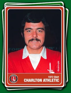
Get Your Kit On
 I am grateful to Irish Addick for highlighting a great website, Kit Classics which shows a colourful pictorial history of club football kits, both home and away.
A quick click on the following link for Charlton's kits should be enough to give any fan some nostalgic pangs for a time when footballers were a little bit more 'like us', and when Charlton were, erm... well not very good.
More relevantly, in light of the rather dodgy away kit on display at Upton Park, it should draw attention to the fact that our kit designers should pay us much respect to history in the design of our away kit as our home kit. Fans would be in uproar if we ran out at The Valley wearing blue, so why is it acceptable for us to welcome the new Dowie era in with socks seemingly borrowed from the local pub rugby team? It reminds me of the club's obsession with green and purple for a couple of seasons in the mid-1990s that saw the team resembling ball boys at Wimbledon.
Our away kit should be white, or perhaps yellow. Both colours stand out, look smart and have been used regularly throughout our history (we won the FA Cup wearing white after all). Our home kit was even white (with red touches) for a few seasons in the 1960s.
Yellow meanwhile was a regular away choice in the early 1980s, a period perhaps not known for much success, but it was a relatively 'glamourous' period thanks to the exploits of Derek Hales, Mike Flanagan, Paul Walsh and the like. It was used again occasionally in the late 1980s, with one 2-2 draw at Highbury especially memorable. More recently it was used during our Championship-winning season in 1999/2000 and again in 2003/04 when we had our best top-flight finish for many decades. And whilst yellow may be identified with cowardice, it's hard to deny it looks smart - just compare the way Liverpool looked on Saturday to the way we did.
Royal blue has been used intermittently and for many fans will be synonmous with that famous night at St Andrews when we preserved our First Division status in 1987. However it's Millwall's colours so let's not get too nostalgic for it. Meanwhile we have dabbled with grey (1988/89), ecru (1998/99) and even sky blue for a season (1992/93). The flirtation with blue/black stripes in 2000/01 was linked to the Inter Milan tie-up at the time; luckily the kit went the same way.
Away kits should be as much of a constant as home kits. In my world, WBA should wear yellow/green stripes, and Man City red/black stripes; Spurs and Arsenal should wear yellow, and Manchester United white (by the way, has anyone else wondered if Spurs' new brown third kit is being worn in homage to their unfortunate lasagne incident?) Elsewhere West Ham should be absolutely prevented from leaving the away dressing room unless they're wearing that sky blue kit with the two claret hoops (unless they're playing Coventry).
I'm getting old aren't I?


Oh I dunno, I've got quite a soft spot for the pyjama kit. Vertical stripes are meant to be slimming, and boy do some of our fanbase (and Andy Reid) need the help in that department.